Adobe color wheel or Adobe Colour wheel is a free color tool offered by Adobe. The same company that owns Photoshop and Lightroom.
Its part of the color.adobe.com web app and for a free tool, it offers a lot of great features and insights into the field of colors.
We will look into one specific tool in great detail today the adobe color wheel , but before we gent into the details of color wheel lets see what the entire web app has to offer.
Adobe photoshop is also one of the best photo editing and photo restoration tools from adobe and is widely used by most photographers and designers.
What all you can do with Adobe color wheel
The web app has 4 main sections and multiple tools inside it. We will see all of them briefly , but our main focus will on the color wheel tool. If you want to skip everything else and head straight to the color wheel then just click here.
#1 : Create
This section offers 4 great tools to color enthusiasts and creative artists. All these tools are absolutely free and do not even require you to sigh in.
Adobe Color Wheel
This tool can be used to create color pallets and rule based color combinations. 10 different rule types and 4 color modes can be used. We will see in detail further down.

Extract Theme
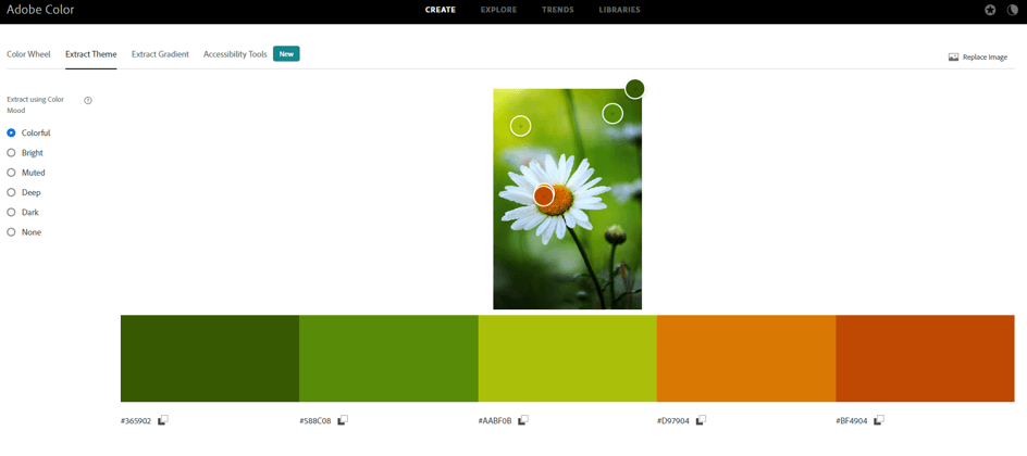
As the name suggest this tool allows you to extract a color theme or color palette from an image. You can read our post on skin color code or peach color code to understand more about color themes and color codes.
One can upload own image or any image that you like and extract colors from it. You can select various points on the image to select the right colors that define that image.
Here is an example of an image of flower , you can see various colors that the app extracted from the image.
Extract Gradients
This is similar to extract theme but instead of a color palette it helps to select a gradient. This can be a great tool to match the color theme of your website or app or any other digital art with the right gradient.

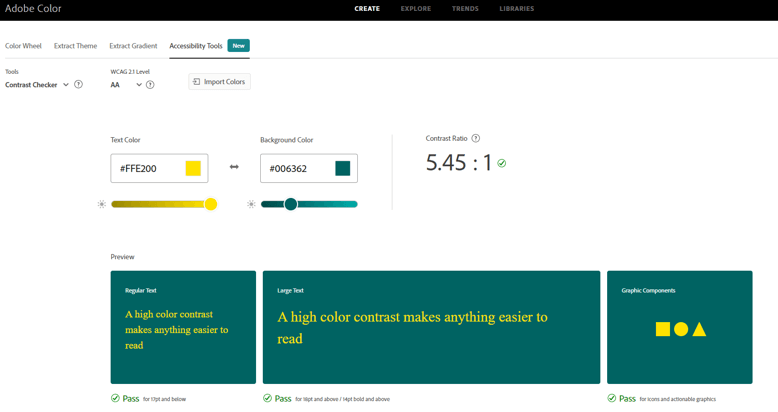
Accessibility Tool
This is again a fantastic tool to check the contrast between a background color and text color. You can check any text color against any background color to understand how it will work and how easy or difficult it will be to read for your viewers.
A contrast ratio of 5 or more is generally considered great for headlines , banners and anything that needs users attention.
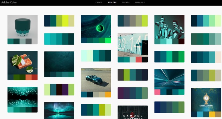
#2 Explore
This section has thousands of free color palettes. One can search any color palette based on an object , a color name or anything that comes to your mind. You may need to sign in to download the palette but its still free.
It allows you to add any color palette to your library and use it later. This is a great tool if you want to get some work done quickly.
#3 Trends
This section allows you to discover current color trends in different industries from the creative communities on Behance and Adobe Stock.
This will keep you up to date with current trends in the creative field.
#4 Libraries
This is where all your saved content from this web app is stored. Everything that you add to library is stored here and is also available to you in various other Adobe tools such as Photoshop and Lightroom once you are signed in.
Now that we have covered the app in brief. We will get into the main topic for this post , the Adobe Color wheel .
What is Adobe Color Wheel ?
Adobe color wheel is a fantastic little tool which helps you to compose or create a color palette based on various rules. Since this is a visual tool , you do not really have to know the rules and you can go by what you see on screen.
The tool allows you to select one color as base color and then provides you with a color palette . While doing this it ensures a harmonic balance of colors based on the color that you have selected as the base color.
What is a color wheel ?
Following images shows a typical color wheel with 12 colors.

The colour wheel, invented by Sir Isaac Newton in the late 17th century, lies at the center of colour theory. Newton mapped the colors in the form of a circle which simplified it to the general public.
The color wheel is a visual representation of colors. It organizes colors by wavelength. Color wheels demonstrate the connection between primary, secondary, and tertiary colors and enable colour relationships to be depicted geometrically.
The primary colors of the classic RYB colour wheel are red, yellow, and blue. By combining basic colors, you may make secondary hues like orange, green, and purple. Then, by combining secondary and primary hues, tertiary colors are created.
There are many various versions of the color wheel, but most common version has 12 colors represented in the form of a circle.
Color Harmony rules in Adobe Color Wheel
Not all colors go well with each other. There are some specific colors that go well with some specific colors. For example orange and teal always go with each other and the combination is really popular. This combination is based on complementary color rule. Most Hollywood films are color graded in these two colors.
Similarly there are many other rules that have been known to provide the combination of colors that generally go well with each other.
Following are the color harmony rules you can apply.
- Analogues
- Monochromatic
- Triad
- Complementary
- Split complementary
- Double Split complementary
- Square
- Compound
- Shades
- Custom
Lets see all these rules in Adobe color wheel in detail and understand how and where to use which color harmony rule.
1. Analogues Color harmony rule
Analogues color scheme of color rule implies selection of three adjacent colors in color wheel.
In this rule there is one dominant color and one supporting color. The third color is generally a blend of the first two colors or an accent color that stands out along with these two colors.
A sunset is a great example of analogues color rule displayed in nature. Red being the primary color , yellow being the supporting color and orange the accent color.

A 60 – 30 – 10 rule is typically followed while using this color scheme in interior design or any other creative work. 60% use of primary color , 30% supporting color and 10% of accent or pop color.
Following is an example of color scheme selected using analogues color harmony rule in adobe color wheel. This tool allows you to select 5 colors instead of three but basically they are only three colors.
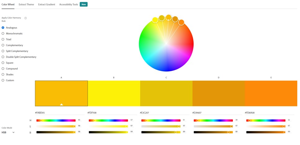
You need to set one color as base color and select Analogues from the rules available on the left hand side. This will automatically give you a combination of colors according tot he analogues harmony rule.
2. Monochromatic color scheme
Monochromatic colour refers to a colour scheme that only has different shades of the same colour. You can use any colour to make a monochromatic colour scheme, but you can’t use more than one.
Adding white to red makes pink, adding black to red makes maroon, and so on. Then, you could have a colour scheme of pink, red, and maroon that was all the same shade.
There are three main components of a monochromatic color scheme:
- Hue – a particular color or base color that you want to use
- A darker version of the same color generally known as shade
- A lighter version of the same color generally known as tint
Here is an example of monochromatic color scheme created using adobe color wheel. Here blue color is selected as the base color and the color scheme has five colors with two colors achieved by adding black to blue and two by adding white to the blue.
3. Triad rule of color harmony
This kind of colour scheme isn’t as hard to understand as it sounds. Rather than putting together three or more colors that are next to each other on the colour wheel, you’ll be taking three colors that are evenly spaced.
All three colors are completely different from each other and tend to create a lively and fun color scheme.
At the same time it is also very hard to get triad color scheme right as all triad combinations may not go well with each other. However there are many proven combinations and here is one of them created using adobe color wheel.
4. Complementary color scheme
Color schemes that are complementary to one another are the most fundamental of all harmonies. Because of their simplicity, they are often used in the world of design.
Put another way, complimentary pairings are colors that are located on opposing ends of the colour wheel (or colour circle), and they may be either primary colors or secondary colors or tertiary colors.
To select complementary color for any color you need to find the HSB ( Hue , Saturation, Brightness) values for the primary color and subtract 180 from the hue. This will give you its complementary color. You can also adjust the saturation and brightness to ensure both colors look good together.
Here is an example of using complementary color scheme in adobe color wheel. Here you can select up to five colors falling on the same line on color wheel.
Using complimentary colors together may create a stunning contrast that is very crisp, particularly if you utilize each colour at its maximum saturation.
This scheme is a blend of warm and cool hues, so you must carefully consider which of the two colors will be the prominent one when it comes to designing.
5. Split complementary color scheme
The split complementary color scheme has three hues as compared to the two in complementary color scheme.
The most basic split complementary colour schemes consist of one key colour and two complementary colors that are next to the key color’s complement colour. This forms a narrow triangle on the color wheel.
The split complementary colour scheme is a flexible, attractive, and simple to implement system that everyone may use.
It has the same benefits as a complimentary colour scheme in terms of contrast and balance between warm and cold colour temperatures, as well as in terms of visual appeal.
Below is an example of split complementary color scheme created in adobe color wheel. You can select one primary color and the tool will automatically give you 4 other colors which are a split of the main complementary color.
6. Double Split complementary
There are two complementary pairs of colors in a double complementary scheme, so we use four colors in this way.
A complementary pair of colors is one that is on either side of the colour wheel. In double split complementary color scheme we use two pairs of complementary colors opposite to each other.
When the four colors are connected on the colour wheel, they form a rectangle. This kind of colour combination is also called “rectangular colors scheme.”
There are 6 main combinations of double split complementary color scheme.
Here is an example of such a scheme created using adobe color wheel.
7. Square
A square color scheme has four colors. In this color scheme you can chose one color as base color and remaining three colors are 90 degree apart from each other and the base color.
Thus the four colors on the color wheel form a square. In an ideal square color scheme all the four colors need to have the same saturation. But variations can be created by using slightly different saturation levels.
Here is an example of the square color scheme on adobe color wheel.
8. Compound
Compound color scheme is similar to the split complementary color scheme but uses colors on the same side of the complementary color rather than opposite sides.
Here is an example of compound scheme on adobe color wheel.
9. Shades
Shades is an interesting color scheme. Many people think of shades as the lighter and darker versions of the same color.
In reality shades are created by adding black to a particular color. An tint is created by adding white to a particular color.
In adobe color wheel you can create shades by adding different levels of black color to the base color.
This is even more visible when you use the HSB color mode, as you can see the different levels of black being used.
10.Custom
This is a free form color scheme. You can select up to five colors that you think go together. This is completely left to your test and visual indication that you get on screen.
There is no rule for selecting base or variant colors.