Complementary color scheme defines the use of two colors exactly opposite to each other on a color wheel. So what is the complementary color or opposite of yellow on color wheel ?
What color is the opposite of yellow ?
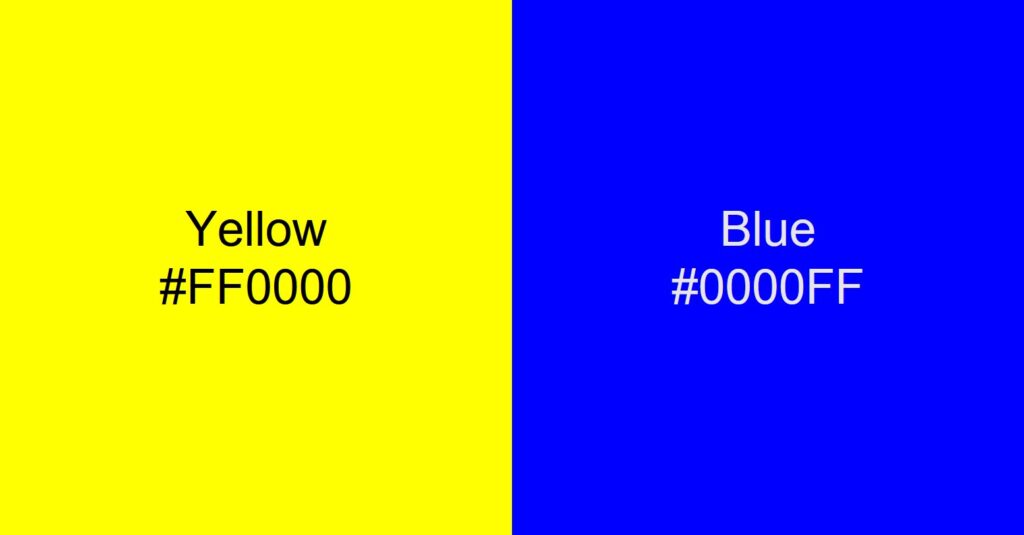
Blue is generally considered as the opposite color of yellow but in reality the exact color opposite of yellow is a slightly different hue of blue and more close to violet.
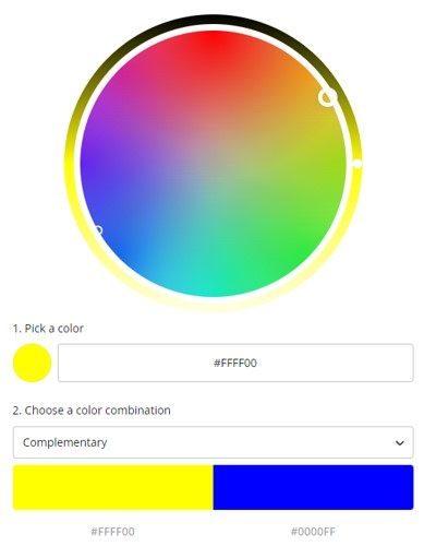
Below image shows the opposite of yellow on color wheel. You can also create it yourself by going to Canva color wheel tool.


To understand this you need to know what is a color wheel ? and what are complementary colors ?. Lets see that in a bit more detail ..
What is color wheel ?
The colour wheel, invented by Sir Isaac Newton in the late 17th century, lies at the center of colour theory. Newton mapped the colors in the form of a circle which simplified it to the general public.
The color wheel is a visual representation of colors. It organizes colors by wavelength. Color wheels demonstrate the connection between primary, secondary, and tertiary colors and enable colour relationships to be depicted geometrically.
The primary colors of the classic RYB colour wheel are red, yellow, and blue. By combining basic colors, you may make secondary hues like orange, green, and purple. Then, by combining secondary and primary hues, tertiary colors are created.
There are many various versions of the color wheel, but most common version has 12 colors represented in the form of a circle.

You can also see above that the opposite color to yellow on color wheel is more violet than blue.
What is a complementary color ?
Color schemes that are complementary to one another are the most fundamental of all harmonies. Because of their simplicity, they are often used in the world of design.
Put another way, complimentary pairings are colors that are located on opposing ends of the colour wheel (or colour circle), and they may be either primary colors or secondary colors or tertiary colors.
To select complementary color for any color you need to find the HSB ( Hue , Saturation, Brightness) values for the primary color and subtract 180 from the hue. This will give you its complementary color. You can also adjust the saturation and brightness to ensure both colors look good together.


