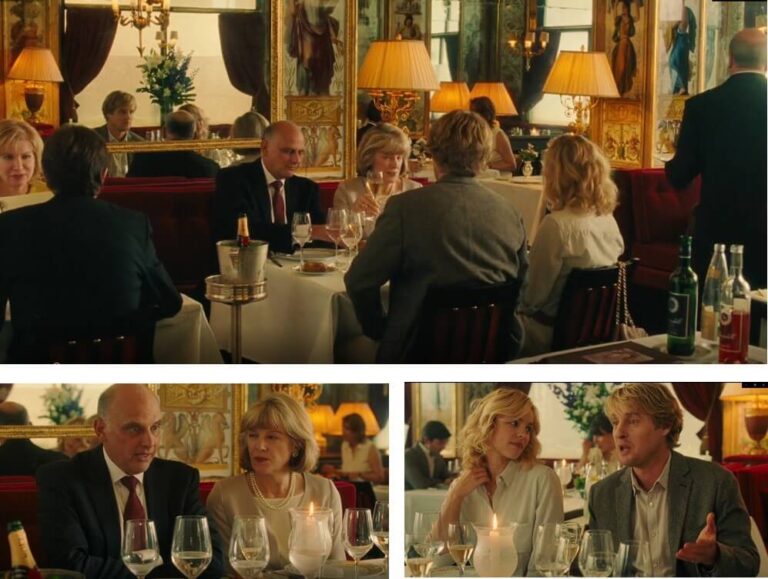
Welcome to our blog post on teal and orange color grading! If you’re unfamiliar with this technique, you may be wondering what it is and why it’s so popular in the film and video industry.
Simply put, color grading is the process of adjusting the colors and tones in a video to achieve a desired look or mood.
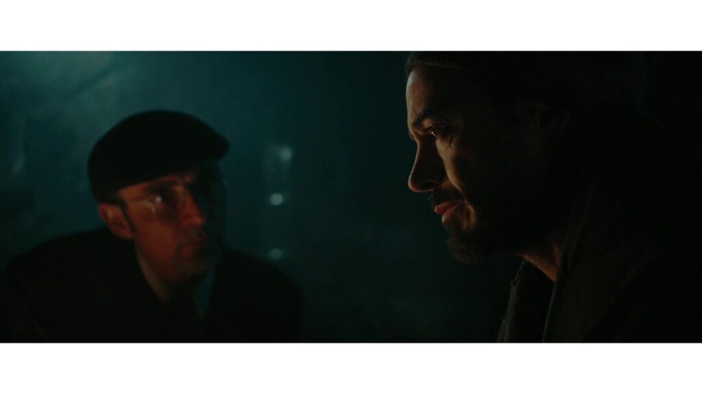
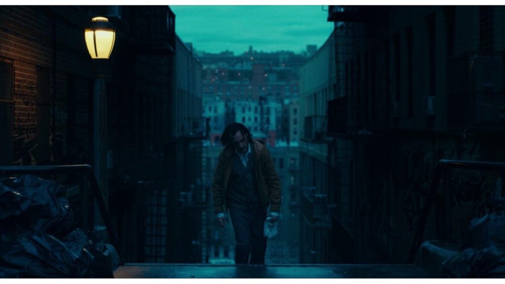
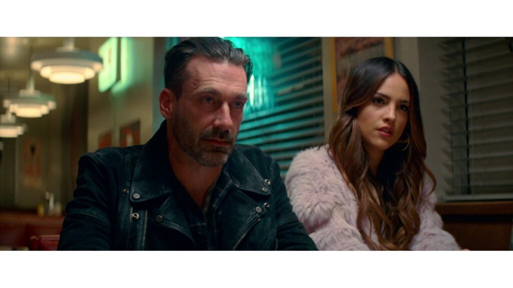
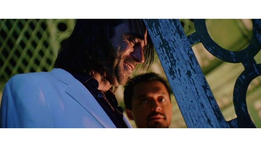
Teal and orange color grading, specifically, involves exaggerating the blue-green tones (teal) and orange tones in a video to create a high-contrast, visually striking aesthetic.
This technique has been used in many blockbuster movies and music videos, and is a favorite among many professional colorists.
In this blog post, we’ll dive deeper into the history and use of teal and orange color grading, as well as provide some tips and tricks for how you can create this look in your own videos.

What exactly is a teal and orange look ?
In the case of the Orange and Teal look, the colorist will typically adjust the colors in the shadows to be more blue-green (teal) , and the colors in the highlights to be more orange. This creates a strong visual contrast between the two color tones, and can be used to create a variety of moods and atmospheres in a video.
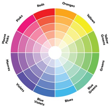
To understand the teal and orange look , we need to take a look at the position of these two colors in the color wheel.
If you see the color wheel the orange and teal colors are opposite to each other , creating this perfect eye pleasing color contrast.
Why is the orange and teal look so popular ?
The teal and orange look has become popular for a few reasons. One reason is that it creates a high-contrast, visually striking aesthetic that can be used to draw the viewer’s attention to specific elements in a scene.
The strong visual contrast between the teal and orange tones can also be used to create a specific mood or atmosphere in a scene, such as a sense of danger or excitement.
Additionally, the teal and orange look is popular because it is relatively easy to achieve through color grading, and can be achieved with most popular color grading software.
Finally, the teal and orange look has become popular because it has been used in many successful movies and music videos, which has helped to establish it as a go-to look in the film and video industry.
The use of the teal and orange look in color grading can be traced back to the early 2000s, when it was popularized by colorists working on music videos and commercials.
One of the earliest examples of the teal and orange look can be seen in the music video for the song “Crazy” by Gnarls Barkley, which was released in 2006.
The video was graded by Sin City colorist, Jean-Clément Soret, and became known for its bold use of the teal and orange color scheme. The success of this music video helped to establish the teal and orange look as a popular choice among colorists.
Since then, the teal and orange look has been used in a wide variety of movies and television shows, including blockbusters like the “Transformers” series and “The Avengers”.
The look has become so popular that it has almost become a cliché in some circles, with some people referring to it as the “Hollywood look”.
Despite this, the teal and orange look remains a popular choice for many colorists, and is likely to continue to be used in the film and video industry for the foreseeable future.
Popular films using teal and orange look
Here are 10 popular films that have used the teal and orange look in their color grading:
- The Avengers (2012)
- Iron Man (2008)
- The Dark Knight (2008)
- Inception (2010)
- Transformers (2007)
- The Martian (2015)
- Mad Max: Fury Road (2015)
- Guardians of the Galaxy (2014)
- Tron: Legacy (2010)
- The Great Gatsby (2013)
This is just a small sampling of the many films that have used the teal and orange look in their color grading. The look has become especially popular in action and sci-fi films, but it has also been used in a wide variety of other genres.
Here are some popular videos explaining how to get the teal and orange look for your video.

